HOW EFFECTIVE IS THE COMBINATION OF YOUR MAIN PRODUCT AND ANCILLARY TEXTS
|
|
|
|
When creating our media product we wanted to make sure there was a constant theme running throughout our main product and our Ancillary texts. One way to create a successful brand is to have something significant relating to your theme, this will enable the target audience to remember the film and products, therefore this allows you to stand out from other products and competitors.
ICONIC IMAGE
|
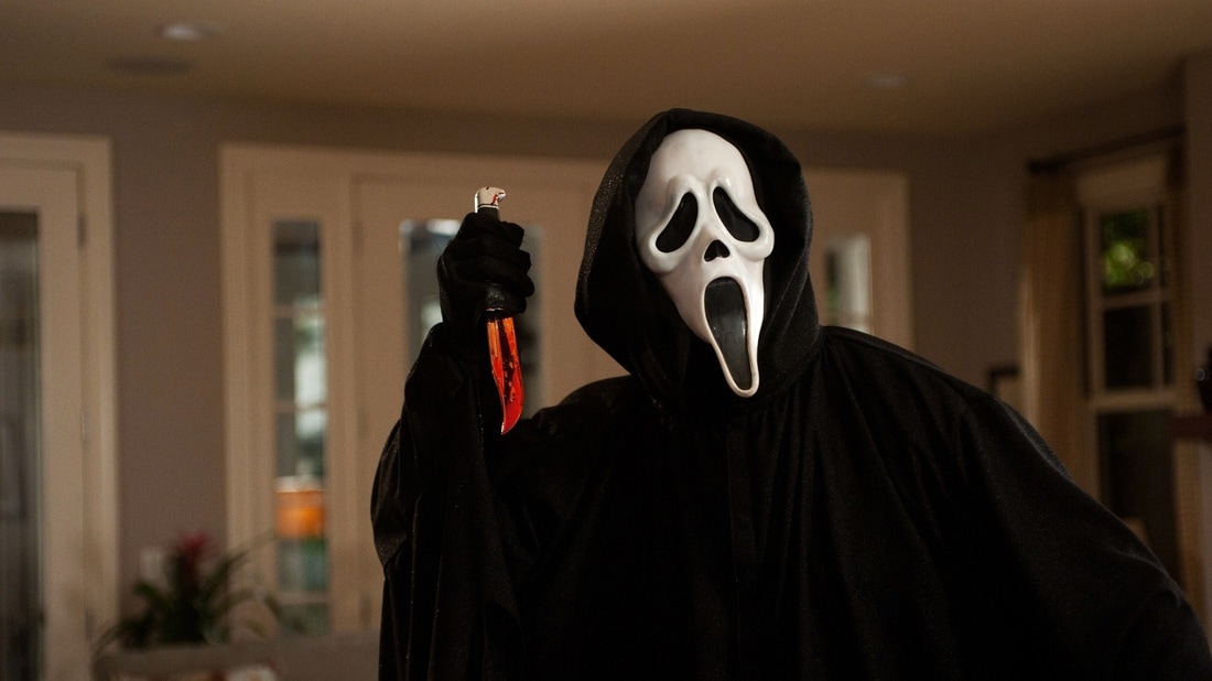
To help decide on our iconic image from our own trailer we researched other horror films and looked at their iconic images to see how effective and rememberable they are to their target audience. An example that we looked at is one of the most famous and iconic horror films, Scream. The film scream was released in 1996. Their iconic image is the mask which the killer wears, this is what the film is most recognised for. When audiences see the mask it is instantly linked to the film scream, as the image became more popular and recognisable as the films image it was used to promote the rest of the films sequels, it also became the main image for their branding. Their iconic image is now how the films are recognised and remembered. their promotion and branding with their films has made them one of the most popular and recognised horror franchise in the film industry.
|
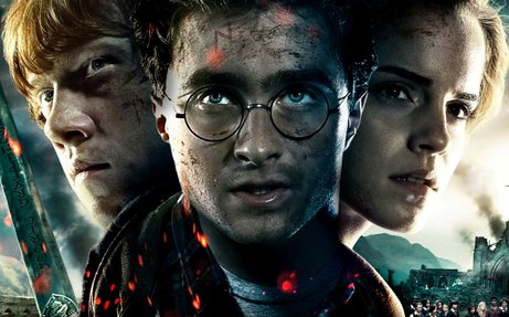
Realising we didn't have a mask or a prop to use for an iconic image, we decided to do further research to see if characters could be used for an image. Harry Potter is a brilliant example for this since their iconic images are of the main characters. The three main characters consist of two boys and one girl, however Harry Potter who stands infront of the two other characters is more important,this is visible by the positioning of the photo.Due to the characters being the iconic image it makes them instantly recognisable to their target audience and instantly linked to the film, since the image was so popular and unique it has been used for the rest of the following sequels. Therefore this is why we used this image style as an inspiration for promoting our own media products to help promote our film. Our aim was to create an image which was just like this one, so it was recognised by our target audience and linked to our film, therefore making it a remembered film in the horror industry.
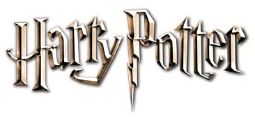
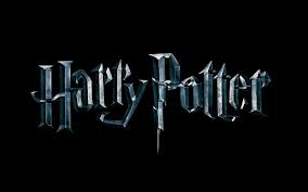
ICONIC TEXT
|
The Harry Potter films are iconic for its font due to it being the same shape and colour all the way through their sequels. For over 10 years now the 'spikey' font has and will always be related to the Harry Potter films, the font plays a big part in the film, since the 'P' is a representation to the scar on Harry's forehead. The dark shadows and boldness to the text demonstrates the deeper meanings behind all of the films and bring mystery to the audience when they see it. Throughout the Harry Potter branding , the memorable font is used on every piece of mercahndise, this consequently makes it instantly linked to the Harry Potter films.
|
|
ICONIC POSTERS
|
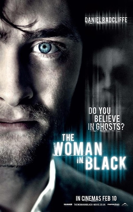
The first poster we looked at was the Woman in Black, starring Daniel Radcliffe as the main character. Daniel starring as the main focus of the image with a faint face figure behind demonstrates immediately the spookiness and the fear it brings, this is clearly evident in Daniels piercing blue eyes, which has a worried and scared feel about them. The iconic text from their film is also on the poster for the title, with these two elements being well known from the film it helps it to become instantly recognisable and remembered as'the woman in black', The use of the faint figure displayed as the background links with the whole running theme of the film, which is a possible element of using themes from the film and incorporating them into the poster. For us this is a very helpful poster due to its iconic image from the film, also the positioning of the characters on the poster brings mystery to the audience, since the victim is at the front, normally showing they are in power. The slight confusion brings the attention to the poster, which is exactly what we want to do, with the use of both an iconic image and iconic text it makes it a successful poster due to it being so recognisable to its audience. |
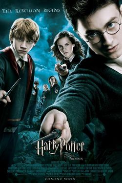
The second poster we looked at was Harry Potter, again with the main character the focus point of the image demonstrating success. Having the iconic image as apart of the poster is a key point when wanting to be remembered by the target audience. With Harry Potter being positioned as the biggest character on the poster shows straight away he is the main focus, Furthermore Harry's scar is clearly visible which is an important part in the film, again demonstrating running themes throughout the films just like 'the woman in black'. The other characters in the background are a lot smaller since they aren't shown as often in the films and aren't as important as the other three. The Black and blue sky suggests a mix of mystery and emotions, drawing attention to the poster. The use of ionic text is used not only for the title but for the subheading, although it is not exactly the same it is very similar with its shape and 'spikeyness'.
This poster is also very useful to help with ideas on how to make our poster successful, with a use of iconic images and text it implies
Magazine covers
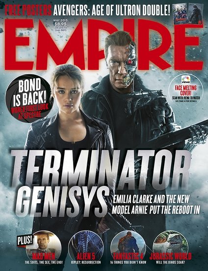
As well as researching posters, we also researched magazine covers that have been made for new film releases to help inspire us with our own magazine. One of the magazines we researched was a company called Empire, who review films and news information about new film releases. Th is cover which we looked at was about a Terminator, this is instantly known due to the iconic image and their iconic text, just like the poster, a magazine needs vital information such as their image and text. The magazine cover also needs to be just as recognisable as the poster. The main image on the magazine is the is of the main characters in the film, this therefore makes it instantly recognisable to fans, so by using them on the front of their magazine cover to promote their new film, it will attract the attention of the films fans and make it easily noticeable to the audience. The title is again unique to the film making it rememberable to be linked to the terminator.
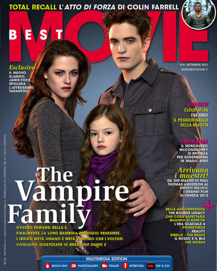
Although our main inspiration was the magazine above we wanted to see a magazine with more text and different positioning of the title. We decided to do this so we would get a more varied idea of a potential magazine cover. This cover again has the main character as the focus image, meaning an instant recognise for the audience. The positioning of the text however is different, it is towards the left rather than in the centre, we preferred this as the image isn't covered as much. Also the text around the image tells you what to expect to see inside the magazine, this is also a vital part to a magazine. The colouring of the magazine is quite dull and dark, there isn't any bright colours, the characters clothing is both the same colour as each other, also their is not much difference between the clothing colour and the background colour, these dull colours demonstrate how the film is going to appear to the audience. However this magazine does not promote any other new film releases which is unusual. We know for definite that for our magazine we wanted to promote other film releases, just like the magazine above.
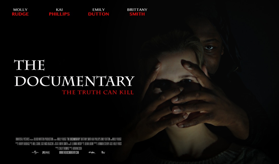
With our poster we decided we wanted to keep it simple but eyecatching at the same time, to do this we wanted to make our poster as dark as possible, to keep the mystery which our trailer holds. Just like the Harry Potter and the Woman in Black poster we used our main characters as our iconic image, instantly linking them to our film, must like we wanted. The contrast of the characters skin colour strongly shows the typical conventions to which we have matched, with a black male character being the vilan, and a pale blonde girl being the victim, The male characters eye is partly the main focus of the image, since it is so white compare to the rest of the photo, the shadowing on the two characters reflects the lighting on the trailer. We chose to have the hands on the face since they are mainly covering all the main features, demonstrating the male figure is in complete control, just like the trailer. The colour of our poster are red, black and white, we chose these colours because black and white contradict each other, like good and evil, and we chose the colour red because it demonstrates danger. Our title of the trailer is in our iconic text, just like the Harry Potter series, we done this since our research showed success. We decided to put our title to the left of the image because we did not want to cover any of the characters up due to it loosing effect. All of the characters that feature in the trailer are placed up at the top, almost like a starring list to make it look professional.
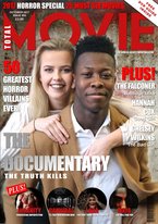
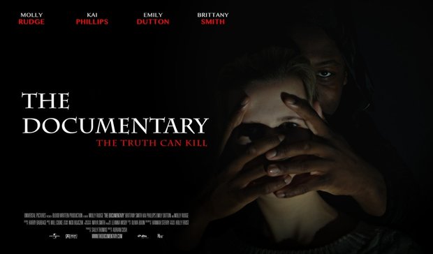
Just like our poster we have used the two main characters as our iconic image, therfore linking both branding products together and to our trailer. However this is the more nicer side of the characters, since they are both smiling and look friendly, rather than in the poster when they look nervous and scary, this contradicts how normal branding happens since it can confuse the audience, however i think with our branding it has worked well and sends 2 messages out to the audeince and they would want to find out what really happens in the film. For our magazine company we used MOVIE since we were most inspired by the layout of their text and their images.
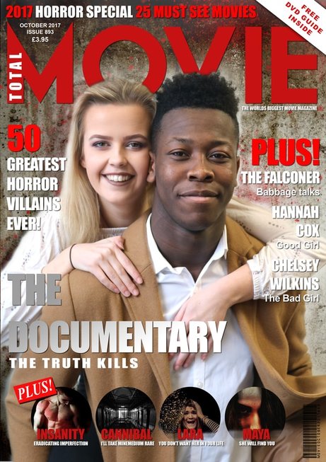
On our magazine we have not matched our iconic texts, this is not my mistake, it is on purpose, our magazine cover looked childish with our text that we used from our trailer and poster, this wasn't the looked we wanted to portray, however we used the same colour for the font, the font we used was big and bold, making it look professional and clear.
On our magazine we have not matched our iconic texts, this is not my mistake, it is on purpose, our magazine cover looked childish with our text that we used from our trailer and poster, this wasn't the looked we wanted to portray, however we used the same colour for the font, the font we used was big and bold, making it look professional and clear.
